The default Bootstrap buttons is not responsive. When the device is too small, the grid is responsive and change the layout, but the buttons stay the same. This tutorial show how to toggle the text from a button when the device required it.
The solution will be tested on different devices/resolutions: mobile, tablet, laptop, desktop
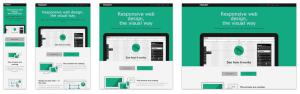
with this behaviour:
#
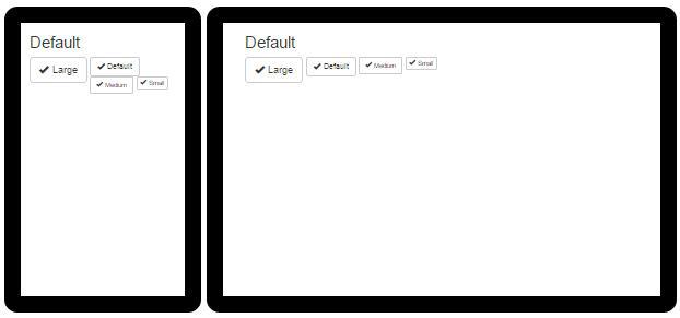
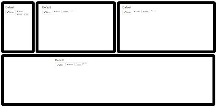
Default Buttons
The default buttons Text is not responsive. On smaller device, it will break the layout because of the buttons size.
Demo
Source
html
<div class="btn-toolbar" role="toolbar">
  <button type="button" class="btn btn-default btn-lg">
    <span class="glyphicon glyphicon-ok" aria-hidden="true"></span>
    Large
  </button>
  <button type="button" class="btn btn-default">
    <span class="glyphicon glyphicon-ok" aria-hidden="true"></span>
    Default
  </button>
  <button type="button" class="btn btn-default btn-sm">
    <span class="glyphicon glyphicon-ok" aria-hidden="true"></span>
    Medium
  </button>
  <button type="button" class="btn btn-default btn-xs">
    <span class="glyphicon glyphicon-ok" aria-hidden="true"></span>
    Small
  </button>
</div>
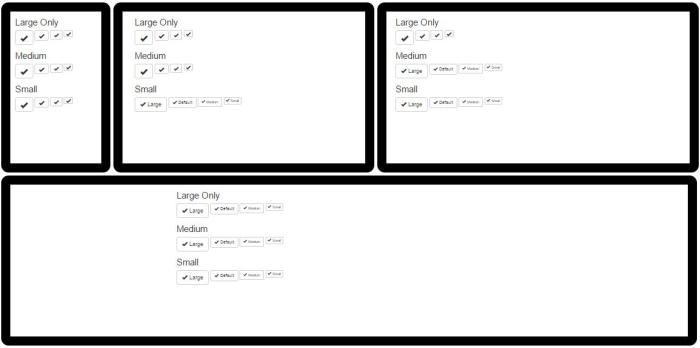
Responsive Buttons
Responsive buttons needs to repond the same way as the grid. On smaller device, text is expected to disappeared on targeted buttons. Button icon must stay the same.
Demo
##
JSFiddle here
http://jsfiddle.net/damien_fremont/nLxcws7q/ http://jsfiddle.net/damien_fremont/nLxcws7q/
Source
The hack is just a little more CSS with a new set of Class named like those of the Grid system : btn-xs-text, btn-lg-text, etc.
index.html
<h2>Large</h2>

<div class="btn-toolbar" role="toolbar">
  <button type="button" class="btn btn-default btn-lg btn-lg-text">
    <span class="glyphicon glyphicon-ok" aria-hidden="true"></span>
    Large
  </button>
  <button type="button" class="btn btn-default        btn-lg-text">
    <span class="glyphicon glyphicon-ok" aria-hidden="true"></span>
    Default
  </button>
  <button type="button" class="btn btn-default btn-sm btn-lg-text">
    <span class="glyphicon glyphicon-ok" aria-hidden="true"></span>
    Medium
  </button>
  <button type="button" class="btn btn-default btn-xs btn-lg-text">
    <span class="glyphicon glyphicon-ok" aria-hidden="true"></span>
    Small
  </button>
</div>

<h2>Medium</h2>

<div class="btn-toolbar" role="toolbar">
  <button type="button" class="btn btn-default btn-lg btn-md-text">
    <span class="glyphicon glyphicon-ok" aria-hidden="true"></span>
    Large
  </button>
  <button type="button" class="btn btn-default        btn-md-text">
    <span class="glyphicon glyphicon-ok" aria-hidden="true"></span>
    Default
  </button>
  <button type="button" class="btn btn-default btn-sm btn-md-text">
    <span class="glyphicon glyphicon-ok" aria-hidden="true"></span>
    Medium
  </button>
  <button type="button" class="btn btn-default btn-xs btn-md-text">
    <span class="glyphicon glyphicon-ok" aria-hidden="true"></span>
    Small
  </button>
</div>

<h2>Small</h2>

<div class="btn-toolbar" role="toolbar">
  <button type="button" class="btn btn-default btn-lg btn-xs-text">
    <span class="glyphicon glyphicon-ok" aria-hidden="true"></span>
    Large
  </button>
  <button type="button" class="btn btn-default        btn-xs-text">
    <span class="glyphicon glyphicon-ok" aria-hidden="true"></span>
    Default
  </button>
  <button type="button" class="btn btn-default btn-sm btn-xs-text">
    <span class="glyphicon glyphicon-ok" aria-hidden="true"></span>
    Medium
  </button>
  <button type="button" class="btn btn-default btn-xs btn-xs-text">
    <span class="glyphicon glyphicon-ok" aria-hidden="true"></span>
    Small
  </button>
</div>
css
/* Small devices (tablets, 768px and up) */
@media ( max-width : 768px ) {
  .btn-xs-text.btn-default:not(span) {
    font-size: 0pt !important;
  }
  .btn-xs-text.btn-default.btn-lg .glyphicon {
    font-size: 18pt !important;
  }
  .btn-xs-text.btn-default .glyphicon {
    font-size: 14pt !important;
  }
  .btn-xs-text.btn-default.btn-sm .glyphicon {
    font-size: 12pt !important;
  }
  .btn-xs-text.btn-default.btn-xs .glyphicon {
    font-size: 12pt !important;
  }
}
/* Medium devices (desktops, 992px and up) */
@media ( max-width : 992px ) {
  .btn-md-text.btn-default:not(span) {
    font-size: 0pt !important;
  }
  .btn-md-text.btn-default.btn-lg .glyphicon {
    font-size: 18pt !important;
  }
  .btn-md-text.btn-default .glyphicon {
    font-size: 14pt !important;
  }
  .btn-md-text.btn-default.btn-sm .glyphicon {
    font-size: 12pt !important;
  }
  .btn-md-text.btn-default.btn-xs .glyphicon {
    font-size: 12pt !important;
  }
}
/* Large devices (large desktops, 1200px and up) */
@media ( max-width : 1200px ) {
  .btn-lg-text.btn-default:not(span) {
    font-size: 0pt !important;
  }
  .btn-lg-text.btn-default.btn-lg .glyphicon {
    font-size: 18pt !important;
  }
  .btn-lg-text.btn-default .glyphicon {
    font-size: 14pt !important;
  }
  .btn-lg-text.btn-default.btn-sm .glyphicon {
    font-size: 12pt !important;
  }
  .btn-lg-text.btn-default.btn-xs .glyphicon {
    font-size: 12pt !important;
  }
}
#
Conclusion
Default Buttons:
Responsive Buttons
Source
https://github.com/DamienFremont/damienfremont.com-blog-labs/tree/master/20150731-bootstrap-responsive_button https://github.com/DamienFremont/damienfremont.com-blog-labs/tree/master/20150731-bootstrap-responsive_button
References
http://getbootstrap.com/css/#buttons http://getbootstrap.com/css/#buttons
http://getbootstrap.com/components/#glyphicons-examples http://getbootstrap.com/components/#glyphicons-examples
http://getbootstrap.com/css/#grid http://getbootstrap.com/css/#grid
Origin
https://damienfremont.com/2015/07/31/responsive-button-with-bootstrap-toggable-text/